


Another one👇...
In this blog, I am going to discuss CSS flexbox🥳.
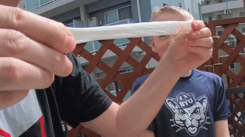
Before going into the actual theory, I want you to imagine a rubber band. If you try to pull the rubber band with full force, the length of that rubber band increases, but the rubber band's breadth decreases, leaving the rubber band's area constant. In CSS, the flexbox is the same as a rubber band
Flexbox means flexible boxes

A long time ago, websites were mainly designed for Pc🖥️. After mobile devices📳 are introduced, it did not seem like a good idea to have the same design that was for Pc.
 So, the design has to be restructured to make the web view on the mobile page user friendly and they should look good too. One of the methods of doing that is to use flexboxes.
Some boring💤 but short theories are as follows:- Main Axis:- The main axis of a flexbox is across the columns.
Cross Axis:- The cross-axis of a flexbox is across the rows.
A flexbox has two parts. The first one is a flex container🫙 and another is a flex item⚽.
Let's discuss some properties...
Flex container properties:
Display:
It is used to decide in what way flex items will be displayed. It can be displayed as a block or inline. e.g.
    .container {
         display: flex;
      }
Flex direction:
It is used to determine the direction of the arrangements of the flex items whether they will be organized around a row or column and in what manner(straight or reverse). e.g.
    .container {
          flex-direction: row-reverse;
        }
Flex wrap:
This property is used to wrap the flex items so that they do not fit into one line and get congested. e.g.
     .container{
           flex-wrap: wrap;
      }
Flex flow:
It is the combination of flex direction and flex wrap.
Justify content & align-items: Justify content is used to create alignment horizontally and align-items is used to create alignment vertically. e.g.
    .container{
         justify-content: center;
         align-items: end;
     }
Gap:
This controls the space between the flex items. e.g.
    .container{
        gap: 10x;
       }
Flex item properties:
Order:
Order property controls the order by which the flex items appear in its parent elements. e.g.
   .item{
        order: 2;
       }
Flex-grow & Flex-shrink:
These two properties are used to stretch and shrink size of flex items. e.g.
    .item{
       flex-grow: 4;
       /* flex-shrink: 2*/
       }
Align-self:
This property is used to give a particular flex item an alignment. e.g.
  .item{
     align-self: auto;
}
So, this more or less wraps up flexbox. If you want to be good in the flexbox, please check out the froggy game🐸.
See you in the next blog